
When the idea for Best Version You began forming, I spent quite a bit of time thinking about my logo. What would convey my message, and how would it resonate with my audience?
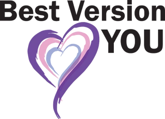
Here’s a behind-the-scenes sneak peek at the Best Version You logo.
First, the three hearts. These represent my holistic approach – mind, body, and soul. Every woman has multiple roles we put on, from mom, professional, daughter, sister, friend. Each of these roles requires different things from our minds, bodies, and soul, and when these things are out of balance, it’s hard to live out the best version of ourselves. We can become so focused on work, our family and intimate relationship suffer. Or, we get so sucked into family dramas or pursuing life with our children, it feels like our careers and friendships are non-existent.
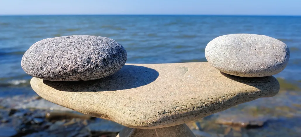
It is by existing in balance that we find our true freedom.
Filling our cup first is not selfish- it’s necessary.
Next, the colors, purple, pink, and blue. Let’s talk about each color.
Royal Purple
Purple has long represented royalty, from the lining of the togas of Romans and Greeks to the monarchs of Europe. You are royalty.This represents the best version of each of us- worthy, whole, a master of our domain. So many of my clients struggle with worth and esteem. It is easy to be the best professionally and feel completely empty as a person. The nagging belief we have to hit this elusive standard that is ever-moving constantly feeds us a lie we are not good enough. You have to define your own standards of success and excellence and live them.
Powerful Pink
Spring is one of my favorite seasons, full of renewal and fresh growth. That led me to include the second heart, which is pink. Pink is also the color of cherry blossoms, one of my favorites. I marvel at how small and tight these little buds are before they literally burst into bloom. I find it interesting that the bloom comes before the leaves. Growth sometimes comes before the evidence of success we want to see.
I remember being a little girl and running barefoot outside, playing and climbing trees. Of course, falls were inevitable. I used to marvel that my skinned knees (or arms, or hands) could go from being scuffed and scraped to fresh pink as they healed. That’s also why I chose this color to represent growth. Pink is the color of scars, of new skin and healing. I’ve yet to meet a single person without a scar. Scars are proof you were stronger than whatever tried to hurt you.
Storm Blue
That leads us to the innermost heart, which is storm blue. I chose this color and this layer on purpose, as who we are, is formed in the storm. We find who we are capable of being not in times of victory, but in the storm. It’s not during our successes, our easy times, but our struggles that we become who we were created to be. It’s one of those odd ironies of life. I’ve learned to embrace the storm, knowing God is going to make me better. Each storm is an opportunity, to grow new pink blossoms, and step further into my royal destiny.
Just like my logo, we learn from the inside out. You won’t stick to a life change until you’ve been able to do a heart change.
I believe in you, and I know the Best Version You is out there. I want to help you Dream, Believe, and Achieve until you get there.
Do you know something else? If you abbreviate Dream, Believe, Achieve, you get D.B.A.
Know what else is abbreviated at DBA? Doing Business As.
So, let’s dream, believe, and achieve, so you can do business as the Best Version You.
See you out there!
-Coach Pam